
Scroll Architecture: The Psychology Behind Instagram Carousels That Actually Convert

There's a specific type of frustration that nobody talks about in this industry.
It's not the frustration of getting zero views. That's at least a clear signal — something's broken, fix it, move on. The frustrating part is when your carousel looks right. Clean design. Good hook. Solid information. You post it, and it performs... fine. Maybe a few hundred impressions. A handful of saves. Some polite comments from people who already follow you.
And then you watch someone else post a carousel on the exact same topic — worse design, simpler visuals — and it pulls 10x your reach.
You've probably blamed the algorithm. Or your follower count. Or the time you posted.
But here's what's actually happening: you're building slideshows, not stories. And Instagram doesn't reward slideshows. It rewards scroll tension.
The education trap nobody wants to acknowledge
The most common advice for Instagram carousels is some version of "teach something valuable." Pick a topic, break it into tips, put one tip per slide, add a CTA at the end.
This worked in 2021. It barely works now.
Not because educational content is dead — it's not — but because the market is saturated with surface-level teaching. Every niche has hundreds of accounts posting "5 Tips to..." and "3 Mistakes You're Making With..." carousels. The format has been so thoroughly copied that the audience's brain has learned to pattern-match it as skippable.
The real problem runs deeper than format fatigue, though. The "tip per slide" structure has a fundamental flaw: it gives people no reason to keep swiping. When slide 3 is a standalone tip and slide 4 is a completely different standalone tip, there's no cognitive thread pulling someone forward. They might save it for later (they won't come back to it), or they'll swipe twice and leave. Either way, they're not reaching your CTA on slide 10.
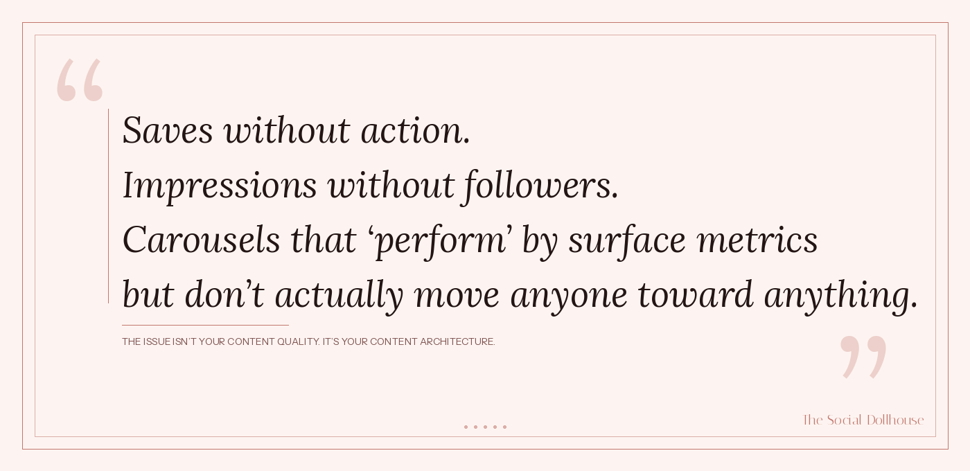
This is why your engagement rate looks decent but your conversions are flat. Saves without action. Impressions without followers. Carousels that "perform" by surface metrics but don't actually move anyone toward anything.
The issue isn't your content quality. It's your content architecture.
What actually makes someone swipe
Before we get into the framework, it's worth understanding the psychology of swiping — because it's fundamentally different from scrolling.
When someone scrolls a feed, they're in passive mode. Their thumb moves automatically, their attention is low, and they're scanning for something that disrupts the pattern. This is why hooks matter — they interrupt passive scanning.
But when someone starts swiping through your carousel, they've shifted into active mode.
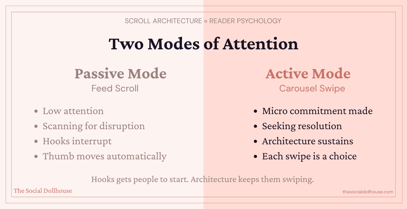
They've made a micro-commitment. They chose to engage. And now, an entirely different psychological mechanism takes over: the completion drive.
Humans have a deep cognitive need to close open loops. It's the same reason you'll watch a mediocre movie to the end, or finish a book chapter even when you're tired. Once a gap is opened — a question raised, a pattern started, a tension introduced — the brain wants resolution.
Most carousels open one loop on slide 1 (the hook) and then immediately close it on slide 2 by starting to deliver information. The tension dissolves. The completion drive has nothing to pull toward. Swiping becomes optional.
High-performing carousels do the opposite. They open a new micro-tension on every single slide. Not by withholding information artificially — that's clickbait and people can feel it — but by structuring the revelation so that each piece of information raises a new question. Each slide resolves one tension and creates another.
This is what I call scroll architecture: the deliberate sequencing of information to create compounding cognitive momentum. And once you understand it, you'll see exactly why some carousels feel impossible to stop swiping and others feel like a chore.
The Scroll Architecture Framework
Scroll Architecture isn't a template. It's a structural logic you apply to any carousel, any topic, any niche. It has five layers, and each serves a specific psychological function.
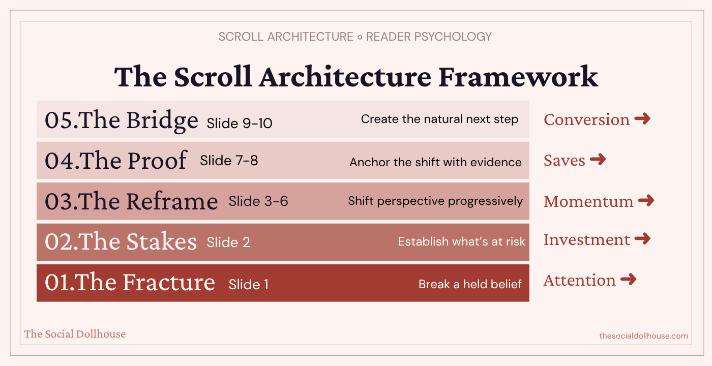
Layer 1: The Fracture (Slide 1)
Most creators understand they need a hook. But there's a critical difference between a hook and a fracture.
A hook grabs attention: "5 Instagram mistakes killing your reach." It works. It's fine. It's also what everyone else is posting.
A fracture breaks a belief: "Your best-performing carousel is actually hurting your account." That doesn't just grab attention — it creates a cognitive gap between what someone believes and what might be true. The brain can't ignore that gap. It has to resolve it.
The difference matters because hooks attract eyeballs, but fractures create emotional investment. When someone feels their current understanding has been challenged, they're not just curious — they're committed to finding out why they might be wrong. That commitment carries them through the entire carousel.
The strongest fractures target beliefs your audience holds with confidence. Not obscure misconceptions — things they'd actively defend. "Consistency is the key to growth." "You need to post educational content." "Hooks are the most important part." When you crack something they're sure about, the scroll momentum writes itself.
Layer 2: The Stakes (Slide 2)
This is the slide most creators skip entirely, and it's why their carousels bleed attention after the hook.
Slide 2 isn't where you start teaching. It's where you establish what's at risk. What is the cost of the old belief? What are they losing by not understanding this? What happens if they keep doing what they're doing?
This might sound manipulative, but it's not — it's honest framing. If your content is actually valuable, then there is a real cost to not understanding it. Articulating that cost isn't fear-mongering. It's giving people a reason to pay attention beyond idle curiosity.
Stakes transform casual interest into genuine investment. Without them, your audience is browsing. With them, they're leaning in.
A few ways to establish stakes without being dramatic: name the specific result they're not getting ("this is why your carousels get saves but never drive DMs"), identify the hidden cost of their current approach ("you're training the algorithm to show your content to the wrong people"), or frame the gap between where they are and where they could be.
Layer 3: The Reframe (Slides 3–6)
This is the body of your carousel, and it's where the architecture matters most.
The instinct here is to deliver your information in a list: point one, point two, point three, point four. Resist that instinct completely.
Instead, build a progressive reframe. Each slide should shift the reader's perspective one step further from where they started. Not by adding more information, but by recontextualizing the information they already have.
Think of it like this: a list carousel says "here are four things you should know." A reframe carousel says "here's why everything you thought you knew is slightly wrong, and here's how to see it correctly — one layer at a time."
The key technique is what I call a slide bridge: the last line of each slide should create a direct tension that only the next slide resolves. Not a cliffhanger — that feels cheap. A genuine conceptual gap.
For example, if slide 3 explains why consistency doesn't drive growth, the final line might be: "So if consistency isn't the lever, what is?" Slide 4 then answers that — and in its answer, raises the next question.
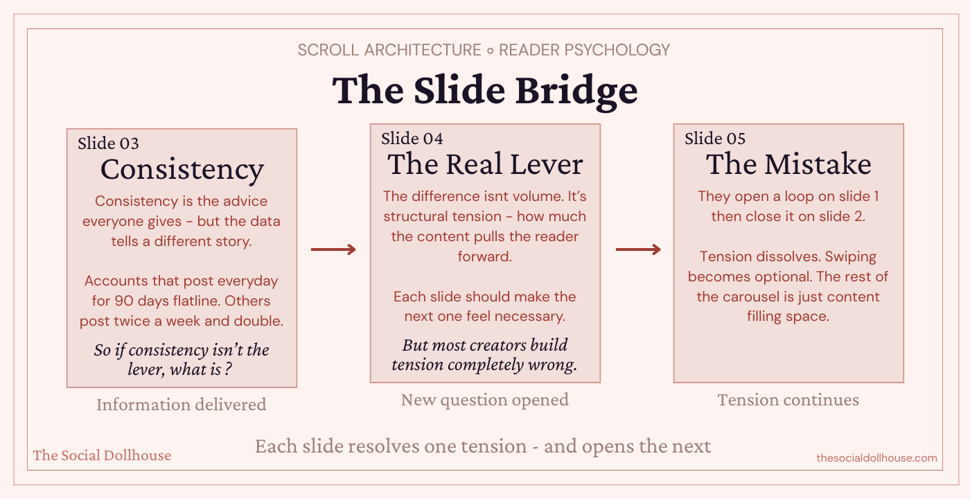
This creates a chain of micro-commitments that pulls people through to slide 7 or 8 without them consciously deciding to keep swiping.
The reframe slides are also where you build authority. Not by saying "I'm an expert" but by demonstrating a level of insight that the audience hasn't encountered elsewhere. If your reframe feels like something they've already heard, the architecture collapses. Originality of perspective is structural, not decorative.
Layer 4: The Proof (Slides 7–8)
By slide 7, your audience has been pulled through a belief shift. They started with one understanding, and you've progressively moved them to a new one. But shifted beliefs are fragile. Without proof, people snap back to their defaults within minutes.
This is where you anchor the shift with evidence. Not testimonials or screenshots (though those work in certain contexts) — I mean structural proof. A specific example that demonstrates your framework in action. A before/after that makes the difference tangible. A data point that validates the reframe.
The proof slides serve a dual purpose: they cement the new belief, and they're the most saveable slides in your carousel. When someone encounters a concrete example or framework they can reference later, that's when the save impulse fires. Not on the tips slides — on the proof slides.
This is also where you earn the right to make your CTA. If the proof is strong, the audience trusts you. If they trust you, the next step feels natural rather than transactional.
Layer 5: The Bridge (Slides 9–10)
The final layer is not a CTA in the traditional sense. It's a bridge — a transition from the value you've delivered to the logical next action.
Most creators treat the last slide like an afterthought: "Follow for more!" or "Save this for later!" These are weak bridges because they ask for something without offering anything in return.
A strong bridge does three things. It summarizes the shift (one line reminding them what they now understand differently). It identifies the gap between knowing and doing (they have the framework, but application requires more depth). And it offers a clear, specific next step that fills that gap.
"Now you know why your carousels aren't converting. The full framework — with slide-by-slide breakdowns and examples — is in the blog post. Comment SCROLL and I'll send it to you."
This works because the CTA is a continuation, not a transaction. They're not being sold to. They're being offered the next logical piece of something they've already invested in understanding.
Quick Reference: The 5 Layers
Layer 1: Fracture → Break a belief
Layer 2: Stakes → Show the cost
Layer 3: Reframe → Shift perspective progressively
Layer 4: Proof → Anchor with evidence
Layer 5: Bridge → Create a natural next step
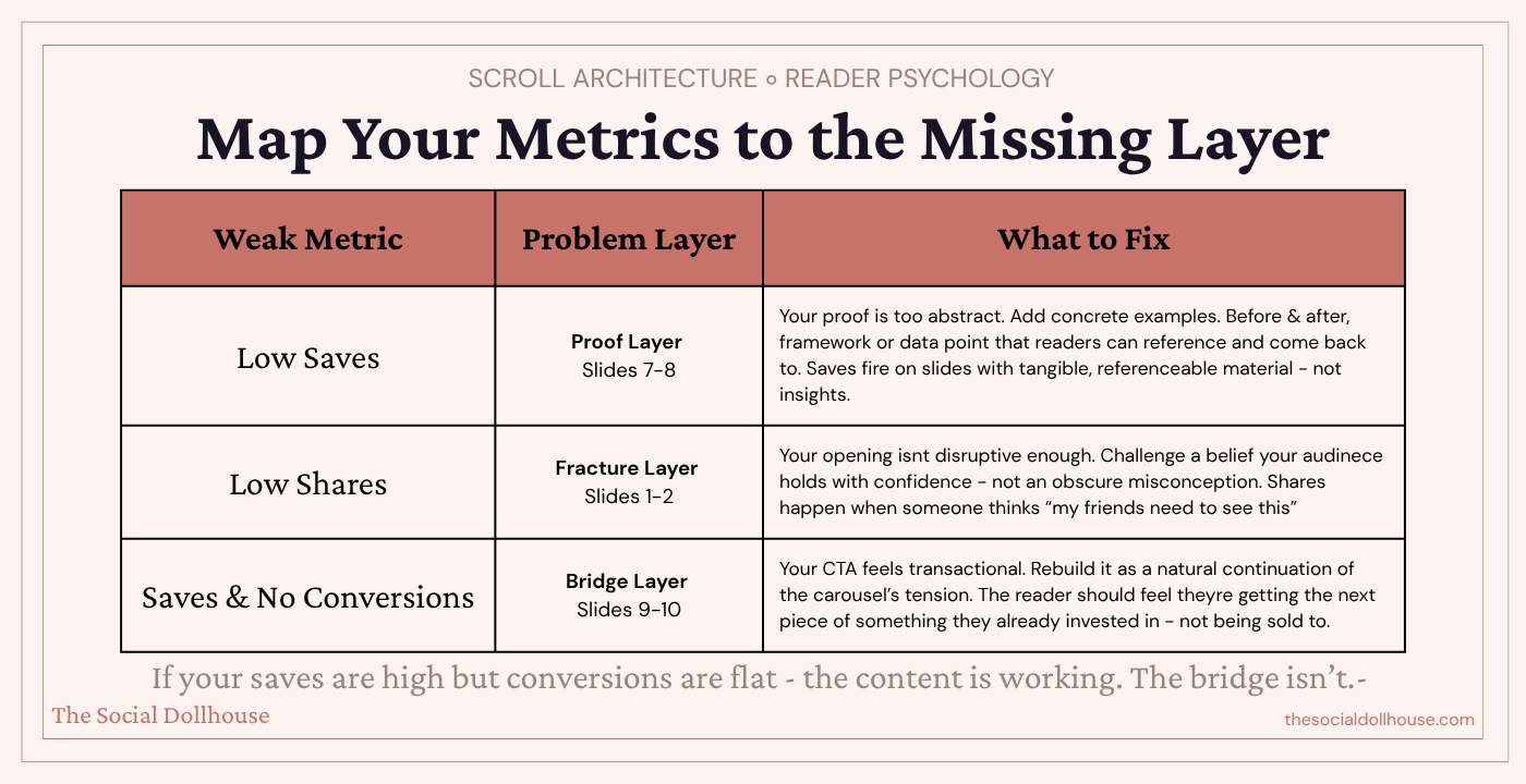
The architecture behind saves, shares, and conversions
Once you understand Scroll Architecture, you can reverse-engineer why certain carousels perform differently.
Carousels that get saved have strong proof layers — slides 7 and 8 contain frameworks, examples, or reference material that people want to come back to. If your saves are low, your proof layer is probably too abstract.
Carousels that get shared have strong fracture and stakes layers — slides 1 and 2 challenge a belief so effectively that people think "my friend needs to see this." If your shares are low, your opening isn't disruptive enough.
Carousels that convert have strong bridge layers — slides 9 and 10 make the next step feel so obvious and natural that not taking it feels like leaving something unfinished. If your saves are high but conversions are flat, your bridge is weak.
This is the real diagnostic tool. Instead of guessing what's wrong with your content, you can map each metric to a specific layer and fix the actual structural issue.
The three carousel mistakes that Scroll Architecture eliminates
Building flat sequences. When every slide is the same "weight" — same structure, same energy, same type of information — there's no rhythm. Scroll Architecture creates a natural arc: tension, escalation, proof, resolution. That arc is what makes a carousel feel like it was designed by someone who actually understands content, not someone who followed a template.
Frontloading all the value. Many creators put their best insight on slide 2 or 3, thinking they need to "deliver value fast." But this kills scroll momentum. If the best thing in your carousel is on slide 3, why would anyone swipe to slide 8? Architecture means distributing value strategically — each slide should be more valuable than the last, with the peak at slides 7–8.
Treating the CTA as separate from the content. The biggest conversion killer is a CTA that feels disconnected from the rest of the carousel. When the CTA is built into the architecture — when it's the natural resolution of the tension you created on slide 1 — it doesn't feel like a pitch. It feels like the only logical next step.
What this means for your content strategy
Scroll Architecture isn't just a carousel technique. It's a way of thinking about content sequencing that applies to Reels scripts, blog structure, email sequences — any format where you need to move someone from attention to action.
But carousels are where it's most visible, because the slide format makes the architecture literal. Each slide is a structural unit. You can see the layers. You can diagnose where the momentum breaks. And you can fix it with precision rather than guessing.
If you've been posting carousels that look good but perform flat, the problem isn't your design or your topics or the algorithm. It's that you've been building slideshows when you should have been building architecture.

Put the Architecture to Work
This post gave you the framework — the psychology behind why certain carousels hold attention and others get swiped past, and the structural layers that separate a carousel someone saves from one they scroll through and forget.
But frameworks only matter if you use them. So here are three ways to take this further, depending on where you are right now.
If you want to audit what is already on your account, the Social Media Audit Framework is the place to start. It is a 16-page Canva template that walks you through a full performance review of your Instagram — including content analysis — so you can see which of your existing carousels are actually converting and which ones are just filling your grid. Once you know what is working, you can reverse-engineer why it is working using the Scroll Architecture model and create more of it intentionally.

If you want AI to do the heavy lifting on diagnosis, the Deep Audit System takes it further. It is a system of 150 AI audit prompts across Instagram, TikTok, YouTube, LinkedIn, and Facebook — structured inside a Notion workspace, each one built to diagnose a specific social media bottleneck through Claude.. It includes a dedicated content strategy audit that breaks down exactly how your carousels are performing relative to your other formats — and tells you what to change. It does not just tell you what is wrong. It gives you the strategic direction to fix it.

If you want done-for-you carousel frameworks built on AI, the Content Vault is exactly that. It's a set of 120 premium AI prompts for Instagram — including a dedicated Carousels framework with slide-by-slide prompt sequences mapped to each conversion goal. Instead of starting from scratch every time, you open the Carousels section, choose the format that fits what you're trying to say, and let Claude build the structure for you. Scroll Architecture thinking, baked into the prompts.